Work.
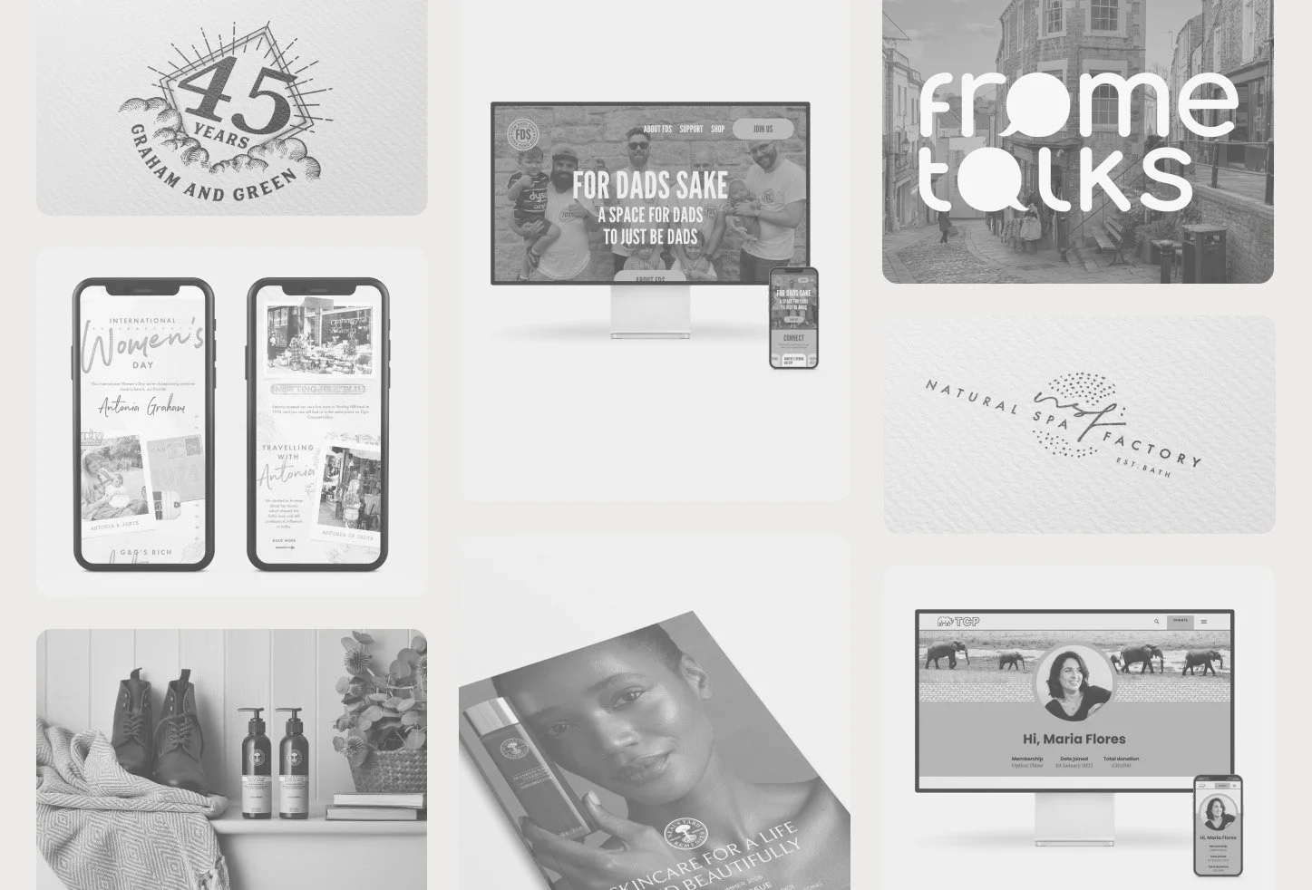
This portfolio brings together my digital and graphic design work, showcasing projects across multiple specialisms and partnerships. If you’re interested in a particular piece or would like to explore a potential collaboration, I’d love to hear from you lthomas@lktcreativedesign.com
For Dad’s Sake.
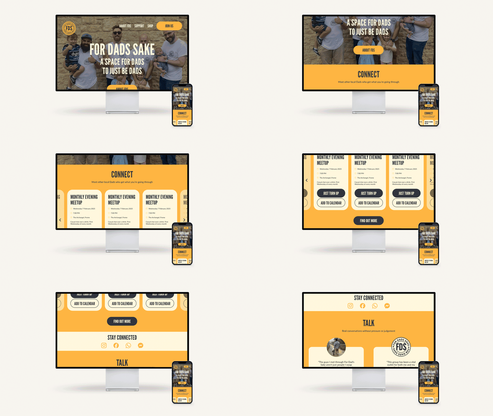
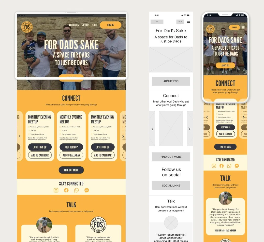
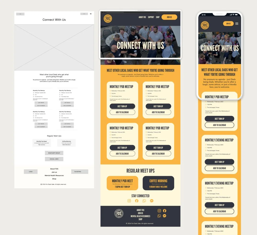
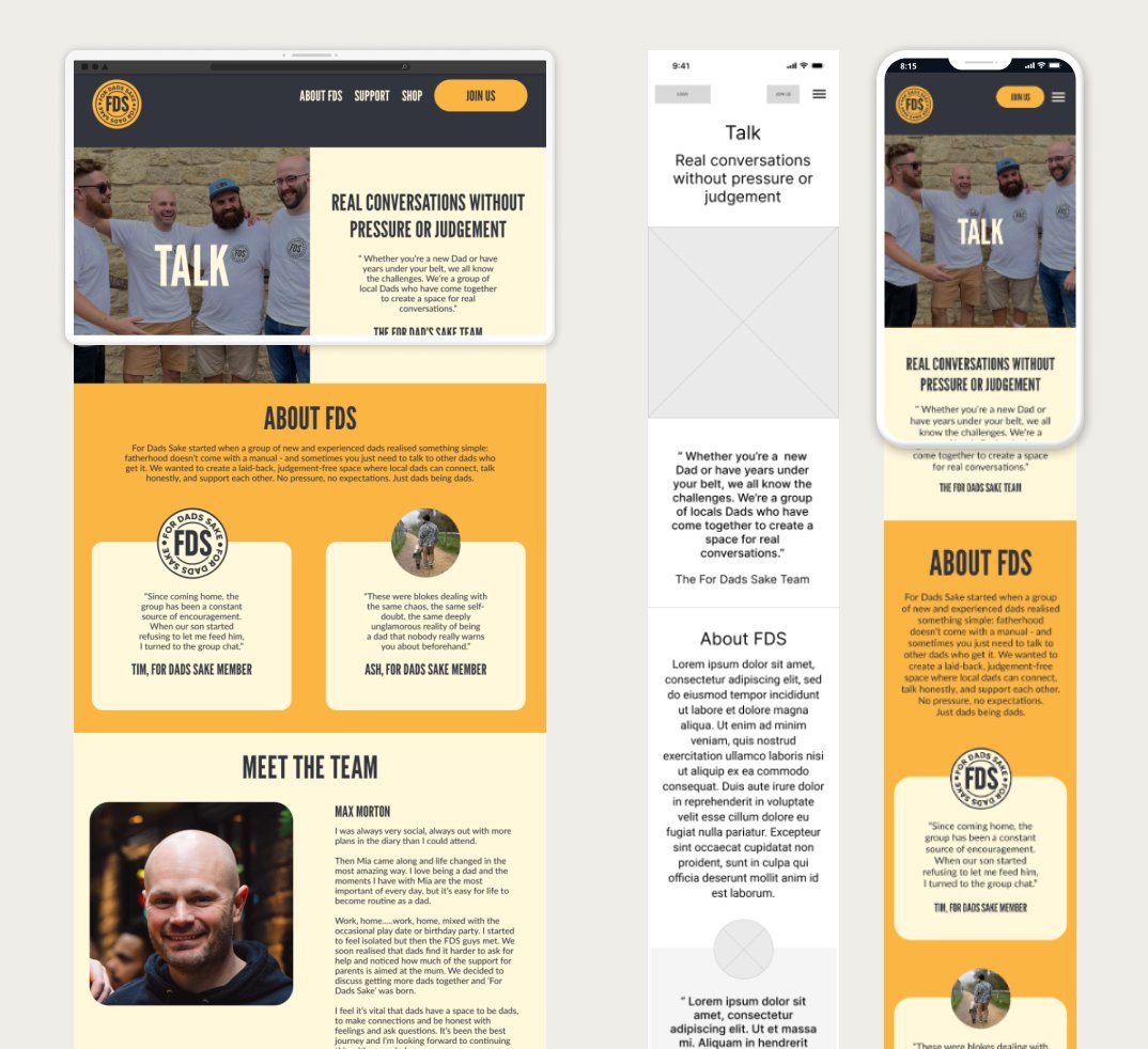
Custom website - designed a bespoke site for a dads’ mental health charity.
Brand identity - created the full brand identity and supporting assets.
UI best practice - applied UI principles shaped by extensive design experience.
Visual direction - set a clear, mission‑aligned visual direction.
User‑friendly interface - built an intuitive, audience‑focused interface.
Accessibility focus - prioritised accessibility and supportive tone.
Resource navigation - ensured easy access to resources and engagement with content.
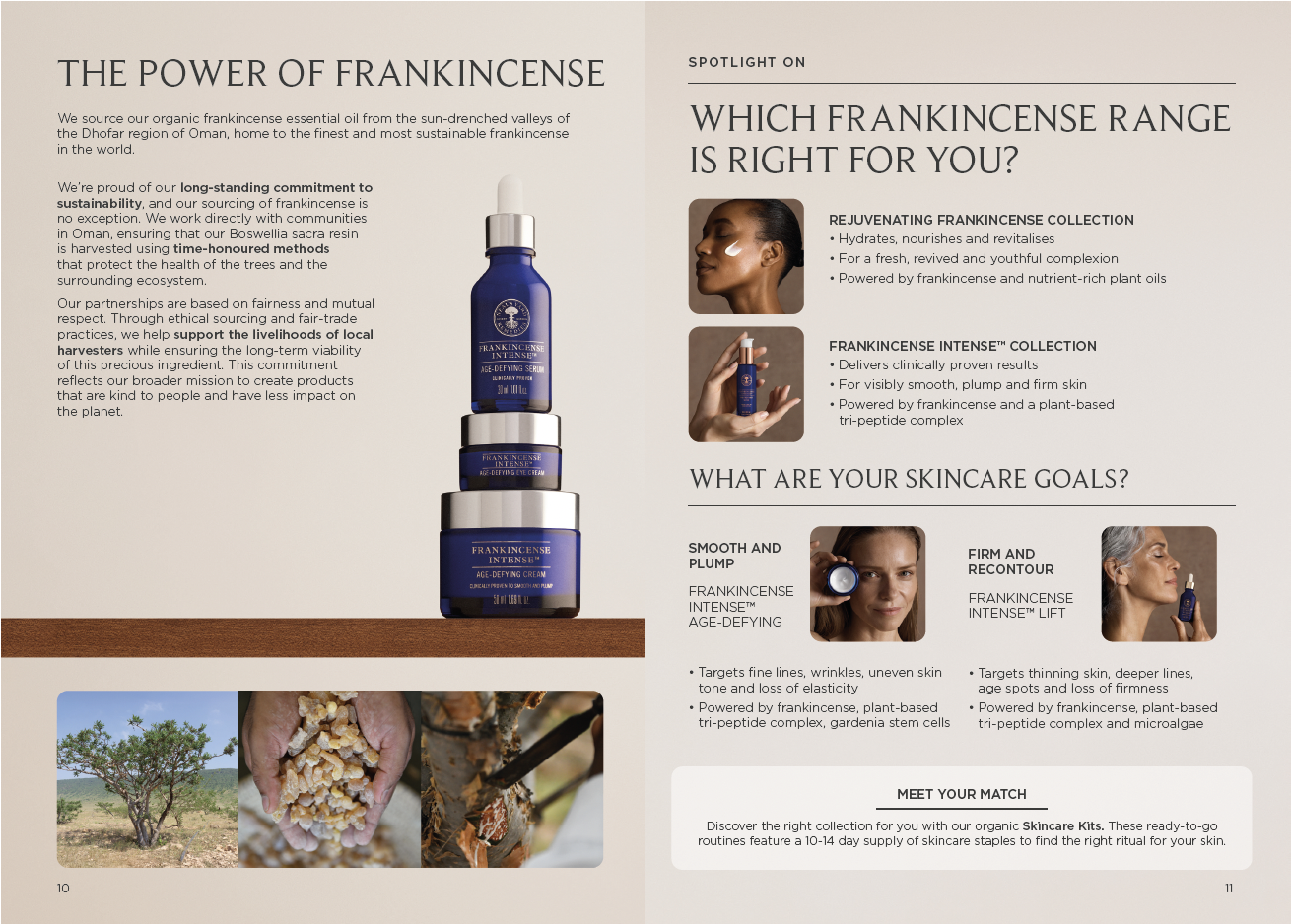
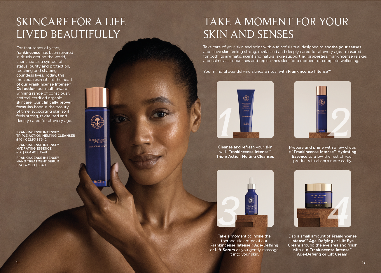
Neal's Yard Remedies.
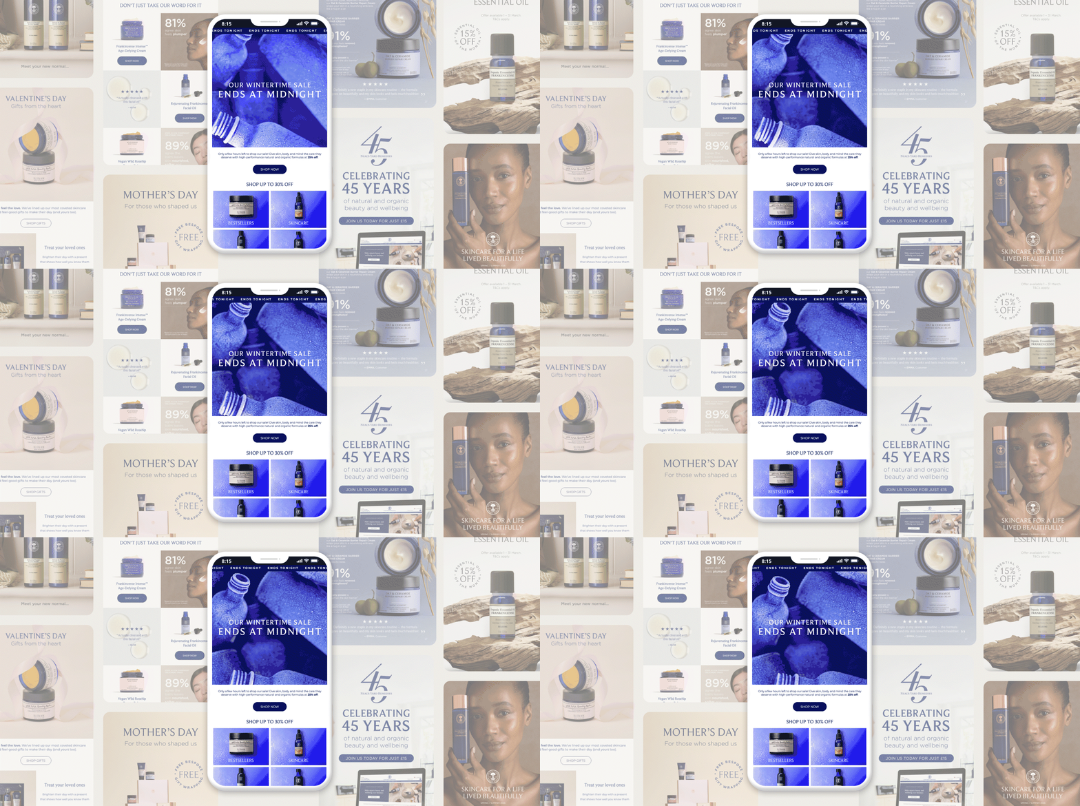
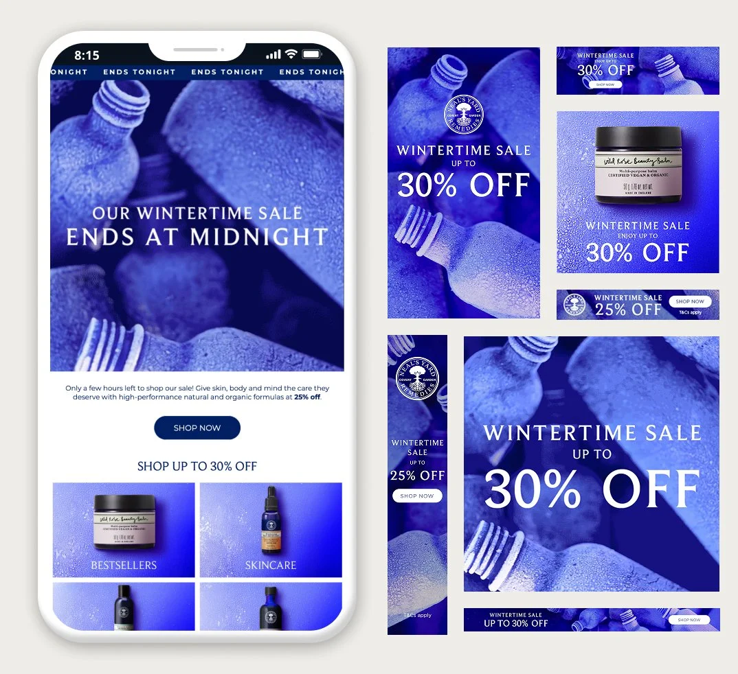
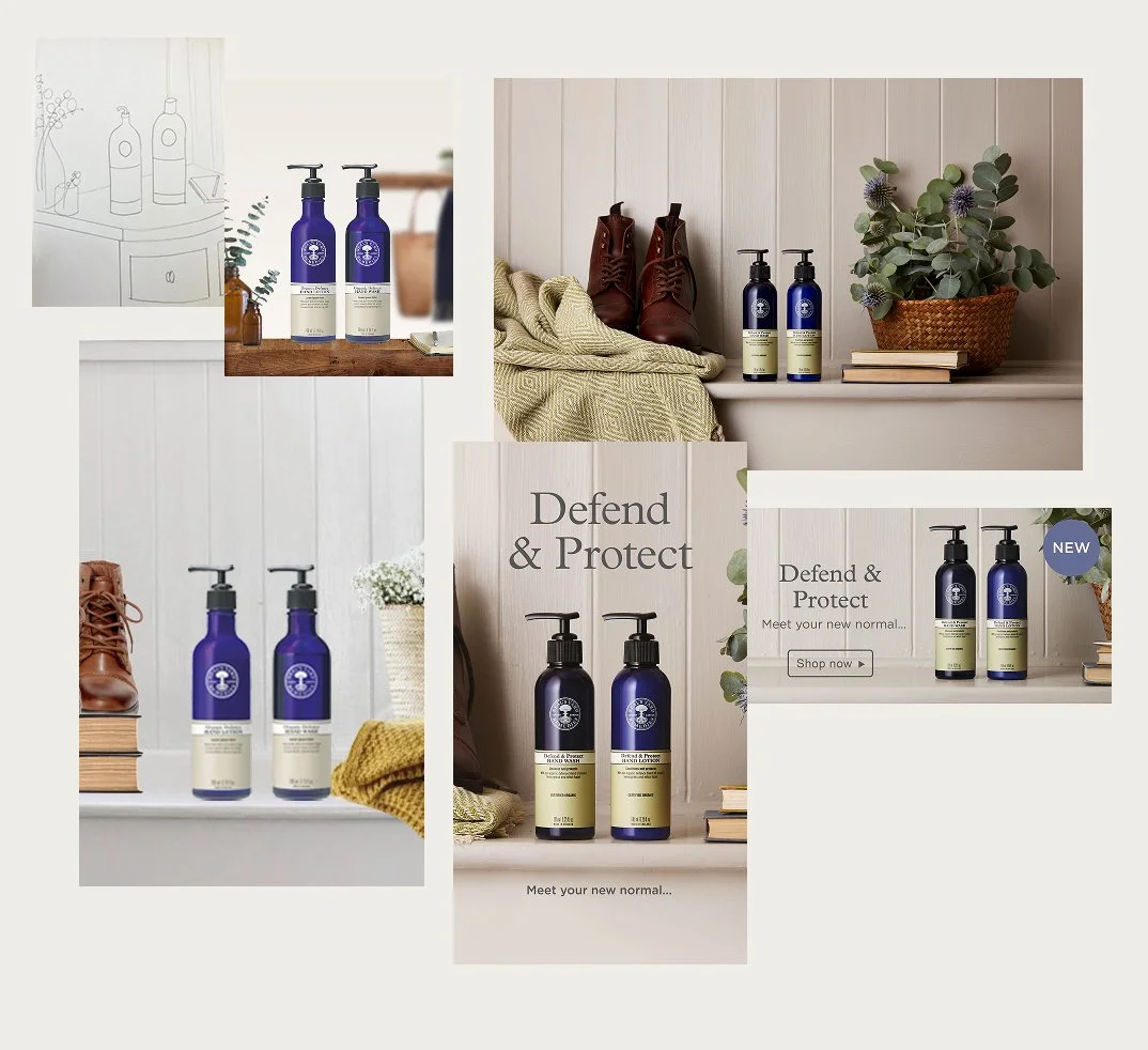
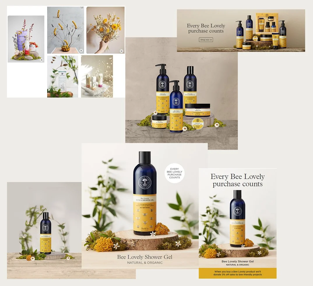
Digital design - experience across digital design, web development, social media and content creation.
Creative leadership - led creative projects and campaigns at Neal’s Yard Remedies.
Website redevelopment - developed a full site rebuild and brand refresh.
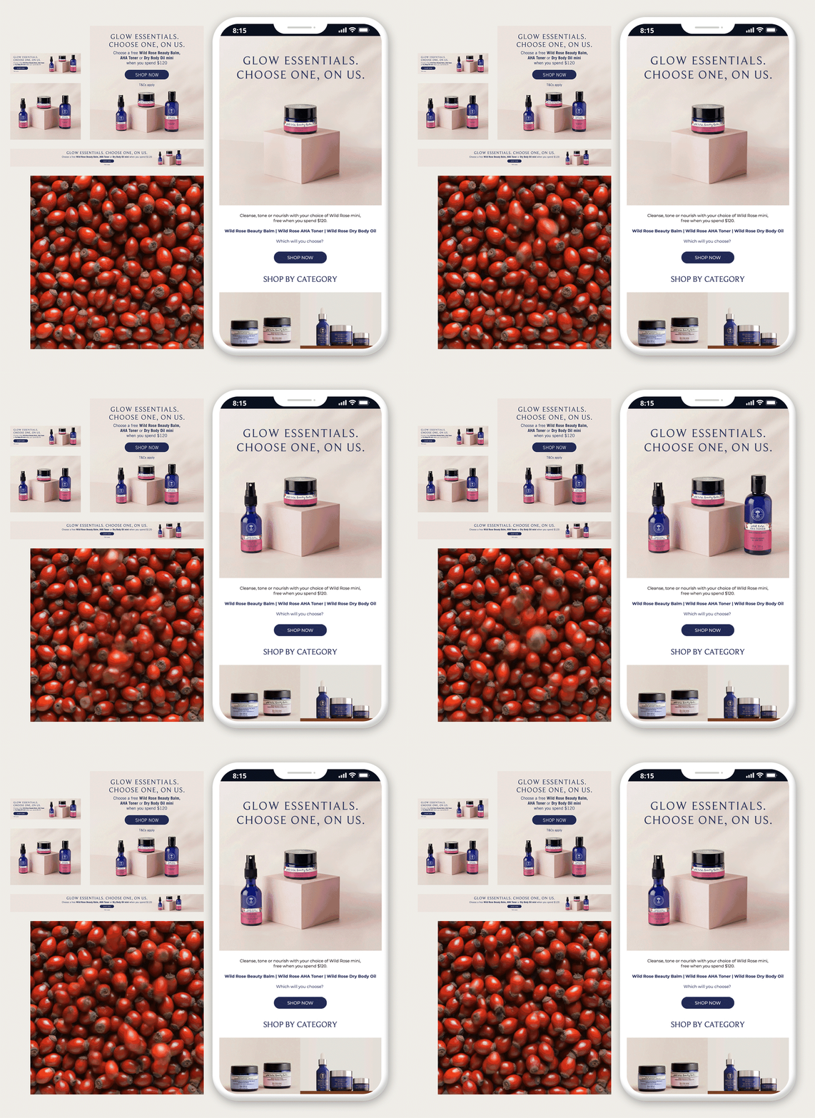
Responsive design - created responsive, cross‑device assets.
Email design - managed end‑to‑end email design.
Social content - produced on‑brand, seasonal creative social content.
Fast‑turnaround work - delivered multiple quick briefs with strong organisation and detail.
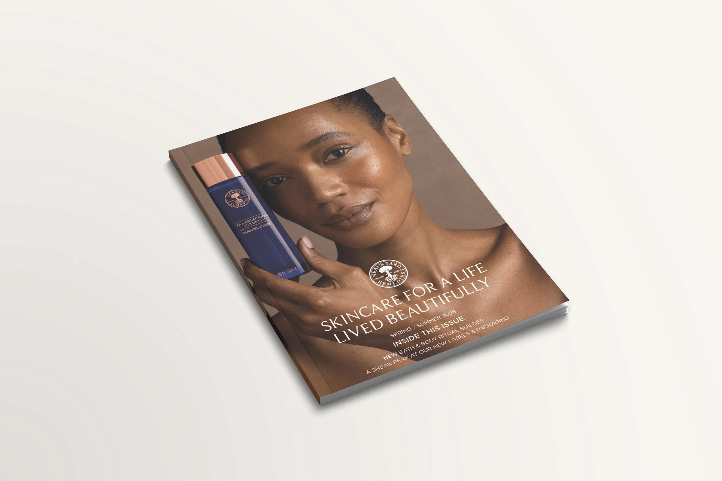
Publications & VM - created publications and visual merchandising assets.
Consultancy channel - led creative for the consultancy channel for Neal’s Yard Remedies.
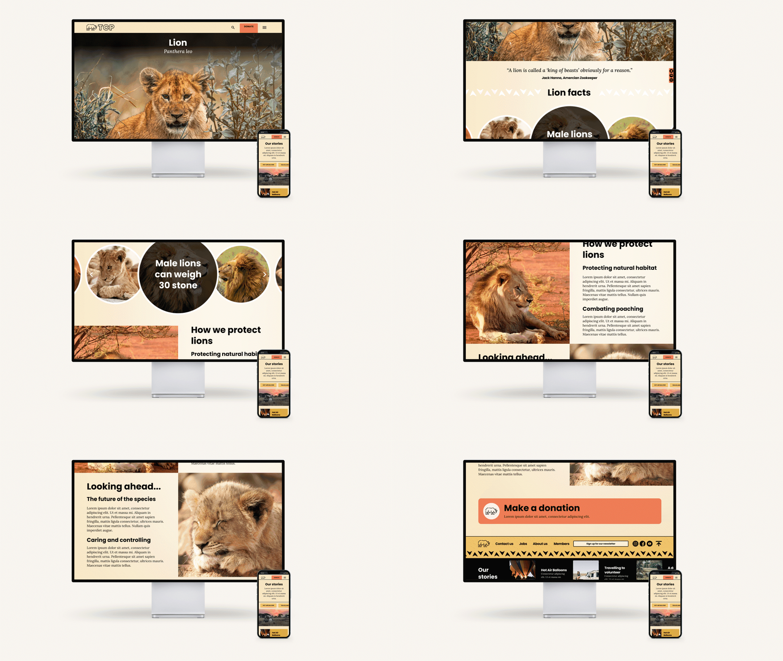
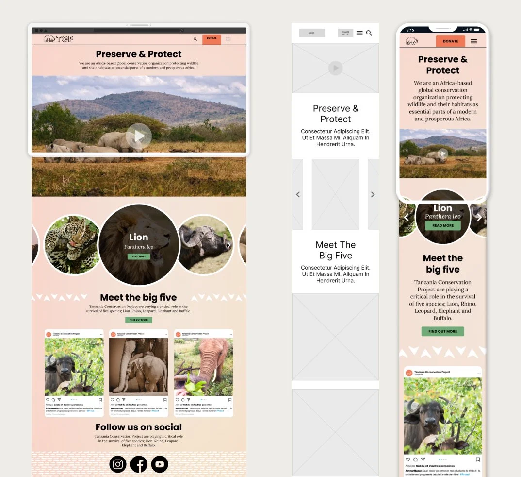
Tanzania Conservation Project
Created as part of a University Short Course completed in 2024.
UX/UI development - building UX/UI skills through a Bath Spa University short course.
UI focus - strong interest in UI design, visual systems and interaction patterns.
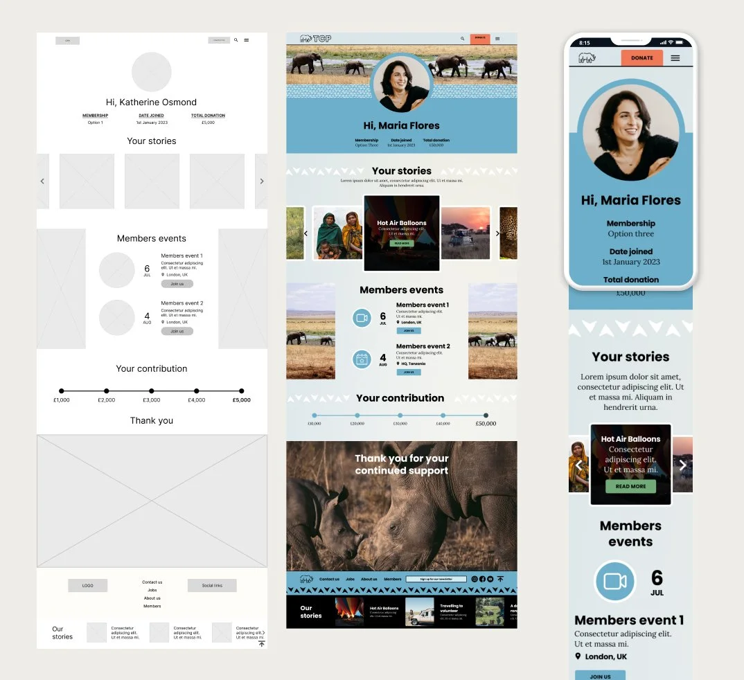
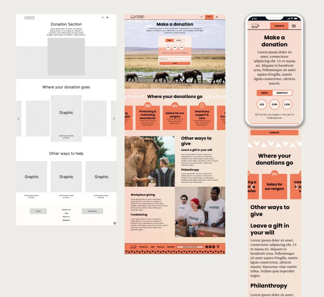
User‑centred project - designed a fictional charity website centred on donors, activists, members and candidates.
User research - ran surveys to define user needs, informing four personas and journeys.
Competitor analysis - completed SWOT analysis to shape sitemap and structure.
Wireframing & prototyping - sketched layouts, built Figma wireframes and developed a full UI kit.
Brand direction - created moodboard, colour palette and accessible design system.
Usability testing - refined the prototype after tutor feedback and participant testing.
Improved UX - delivered a clearer, more intuitive and engaging user experience aligned with project goals.
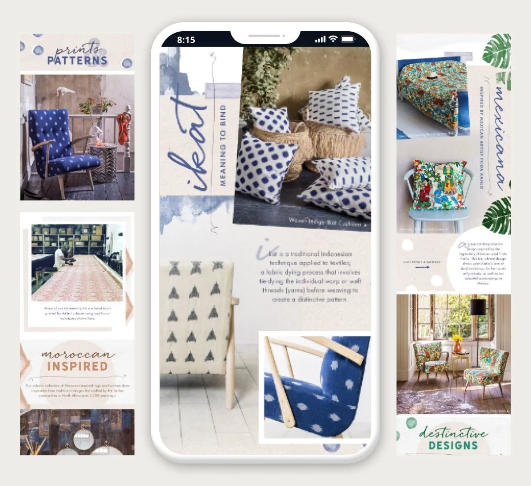
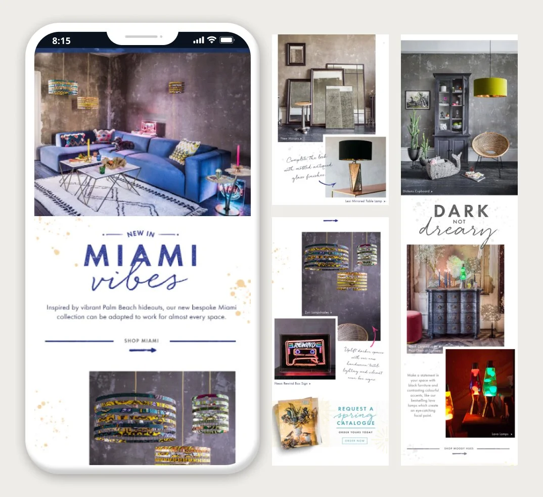
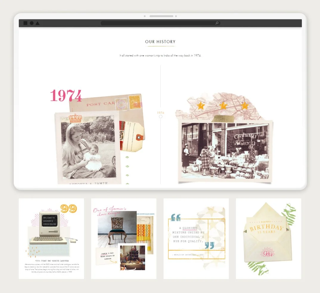
Graham & Green
Creative oversight - managed all digital, marketing and print output.
Catalogue production - produced six seasonal catalogues, including the largest Autumn and Spring editions.
Cross‑team alignment - kept all content accurate, consistent and on‑brand.
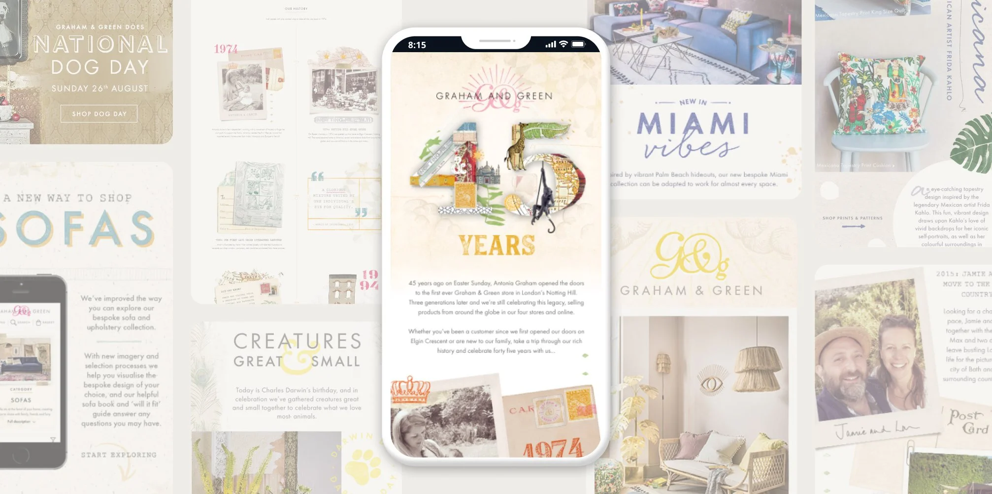
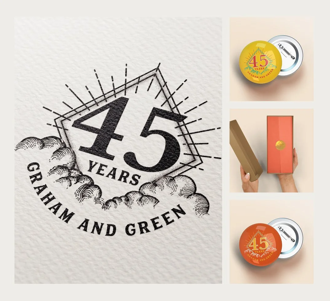
Seasonal branding - developed seasonal branding and brand kits for all touchpoints.
Website rebrand - helped deliver the full rebrand with responsive, heritage‑aligned layouts.
Leadership collaboration - worked closely with senior leadership and external developers.
Illustration work - created hand‑drawn illustrations for a crafted visual style.


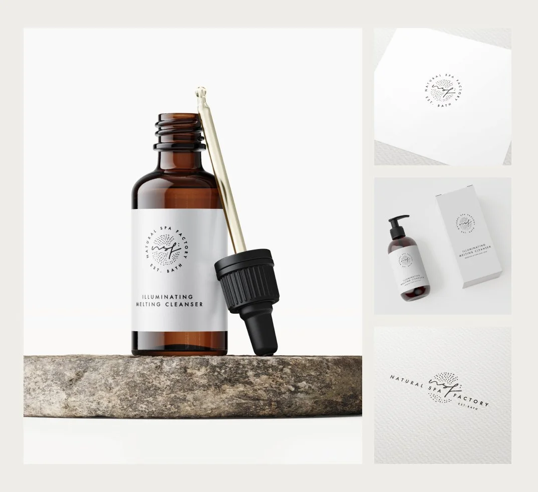
Natural Spa Factory
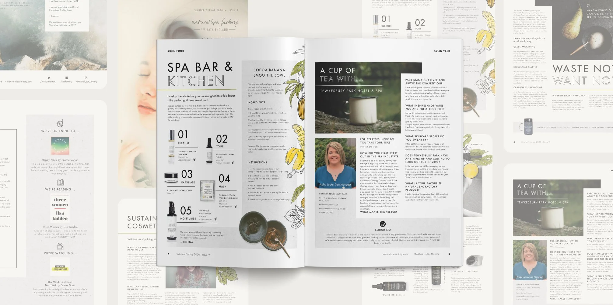
Publication creation - developed the Natural Spa Factory publication from the ground up.
Brand elevation - refined and elevated the brand’s visual identity.
Design ecosystem - extended the refreshed look across email layouts and packaging.
Rebrand direction - developed a cleaner, contemporary aesthetic as part of the wider rebrand.
Logo versatility - created a logo that was adaptable across print and digital.
Minimalist design - adopted a monochrome, stripped‑back approach for a timeless design language.